The birth-year bands
Life Days Left uses five U.S. birth cohorts: Baby Boomers (1946–1964), Generation X (1965–1980), Millennials (1981–1996), Generation Z (1997–2012), and Generation Alpha (2013 onward). These boundaries match the cohort bands used in the U.S. Census Bureau’s 2025 geographic-mobility report. Pew Research Center also documents the 1981–1996 Millennial range and the 1997 start for Gen Z.
The labels make a dense set of birth years easier to scan. They are not natural laws. Pew describes generational cutoffs as analytical tools and warns that differences within generations can be as large as differences between them.
| Generation | Birth-year band | Representative year | Male | Female | Arithmetic mean |
|---|---|---|---|---|---|
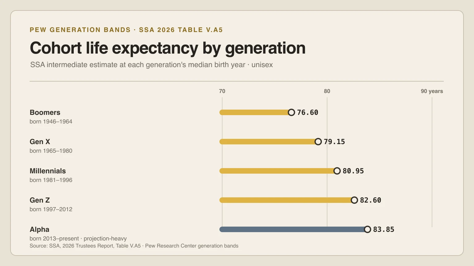
| Boomers | 1946–1964 | 1955 | 73.5 | 79.7 | 76.6 |
| Gen X | 1965–1980 | 1972 | 76.5 | 81.8 | 79.15 |
| Millennials | 1981–1996 | 1988 | 78.4 | 83.5 | 80.95 |
| Gen Z | 1997–2012 | 2004 | 80.2 | 85.0 | 82.6 |
| Alpha | 2013–present | 2019 | 81.6 | 86.1 | 83.85 |
Generation bands and representative years match the public Life Days Left chart. Values are official SSA cohort life expectancy at birth for the Social Security area; the arithmetic mean is derived equally from the male and female entries. View the SSA source table ↗.
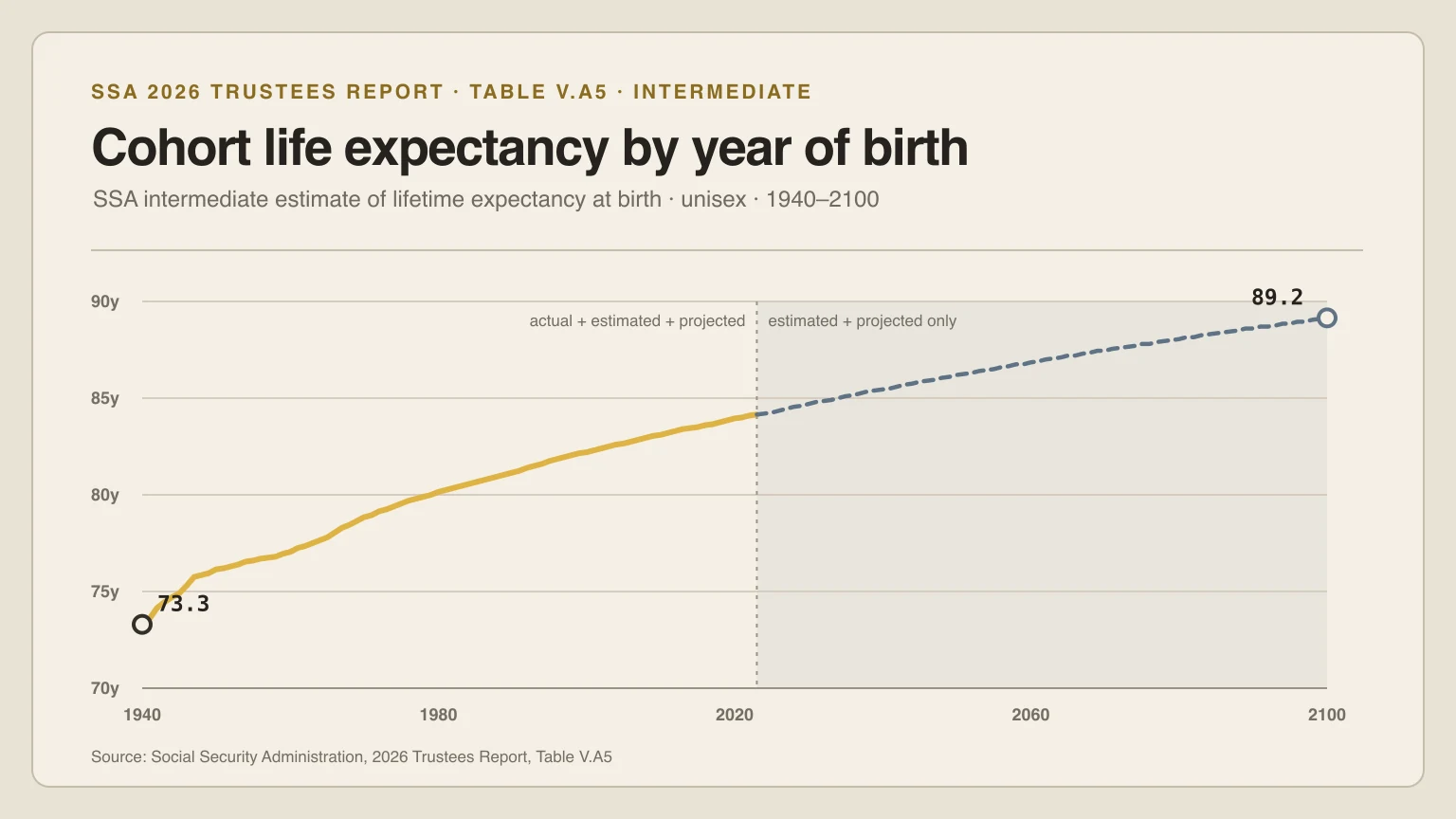
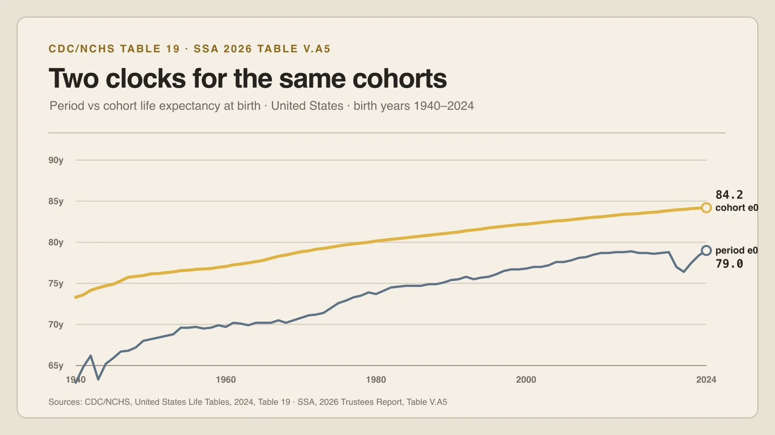
Representative years are stable chart reference points. Male and female values are SSA 2026 Intermediate cohort life expectancy at birth; the mean is Life Days Left’s arithmetic average of those two source columns. SSA’s population is the Social Security area, not only the 50 states and District of Columbia.
Life expectancy for each generation at a glance
Reading the table above as answers: for each generation’s representative birth year, the SSA 2026 Intermediate cohort life expectancy at birth is
- Boomers (1946–1964): 76.6 years for the 1955 reference — 73.5 for males, 79.7 for females.
- Gen X (1965–1980): 79.15 years for the 1972 reference — 76.5 for males, 81.8 for females.
- Millennials (1981–1996): 80.95 years for the 1988 reference — 78.4 for males, 83.5 for females.
- Gen Z (1997–2012): 82.6 years for the 2004 reference — 80.2 for males, 85.0 for females.
- Alpha (2013–present): 83.85 years for the 2019 reference — 81.6 for males, 86.1 for females.
These are at-birth cohort values for one reference date per band, not a prediction for any member of that generation and not years remaining today.
How one range is drawn
For each generation, the chart calculates the percentage of modeled life left for the oldest boundary date and the youngest boundary date. The gold segment spans those two endpoint percentages. For Alpha, the youngest endpoint is the current as-of date, because that cohort is still open.
The white marker is a fixed representative birth date near the center of the band: 1955-01-01, 1972-07-01, 1988-07-01, 2004-07-01, and 2019-07-01. The large day and percentage labels belong to that marker. “Representative” means a stable chart reference, not a statistical median of the living population.
How long will Gen Z live?
There is no single official lifespan for Gen Z. The label covers birth years 1997–2012, and SSA publishes a separate cohort value for every year and sex. For the representative 2004 birth year used in the chart, the 2026 Intermediate table reports 80.2 years for males and 85.0 years for females; their arithmetic mean is 82.6 years.
Generation Alpha’s values lean hardest on projection. For the 2019 reference year the same table reports 81.6 years for males and 86.1 for females, the highest of the five reference years, while the observed record for that cohort covers only childhood. Gen X, Millennial, and Boomer readers read the same column the same way; their bands simply carry more adult and late-life history behind the numbers.
Those values include projected future mortality and describe a population cohort at birth. They are not years remaining today, and they do not guarantee an outcome for a member of any generation. Use the birth-year explorerto inspect every year in the band instead of treating its boundary as a biological breakpoint.
Why younger rows show more life left
Most of the ordering is mechanical: a later birth date has accumulated fewer calendar days lived. The model also adds a birth-year shift from the SSA 2026 Intermediate cohort life-expectancy series. Those two ingredients move the ranges; a behavioral or biological “generation effect” is not estimated.
This is why the chart should not be summarized as “Gen Z will live this many years longer than Boomers.” It shows remaining days under one declared model on one date. It does not isolate causes, represent uncertainty, or compare people at the same attained age.
What comparisons are reasonable
The chart can answer narrow descriptive questions: What does the model return for each representative birth date today? How wide is the modeled range across each birth-year band? How do the displayed values change as another calendar day passes or when the source model is versioned?
It cannot answer who will live longest, whether one generation is healthier, or how long a reader has left. For exact values, use the current data table. For assumptions and equations, use the methodology. The daily public artifact is the chart—not a diagnostic or a countdown for an individual.